Campaign Billboard
High-contrast urban billboard art direction and typography scaling
A large-format outdoor advertising concept showing how minimalistic brand geometry and concise messaging can stop pedestrian and vehicular traffic.
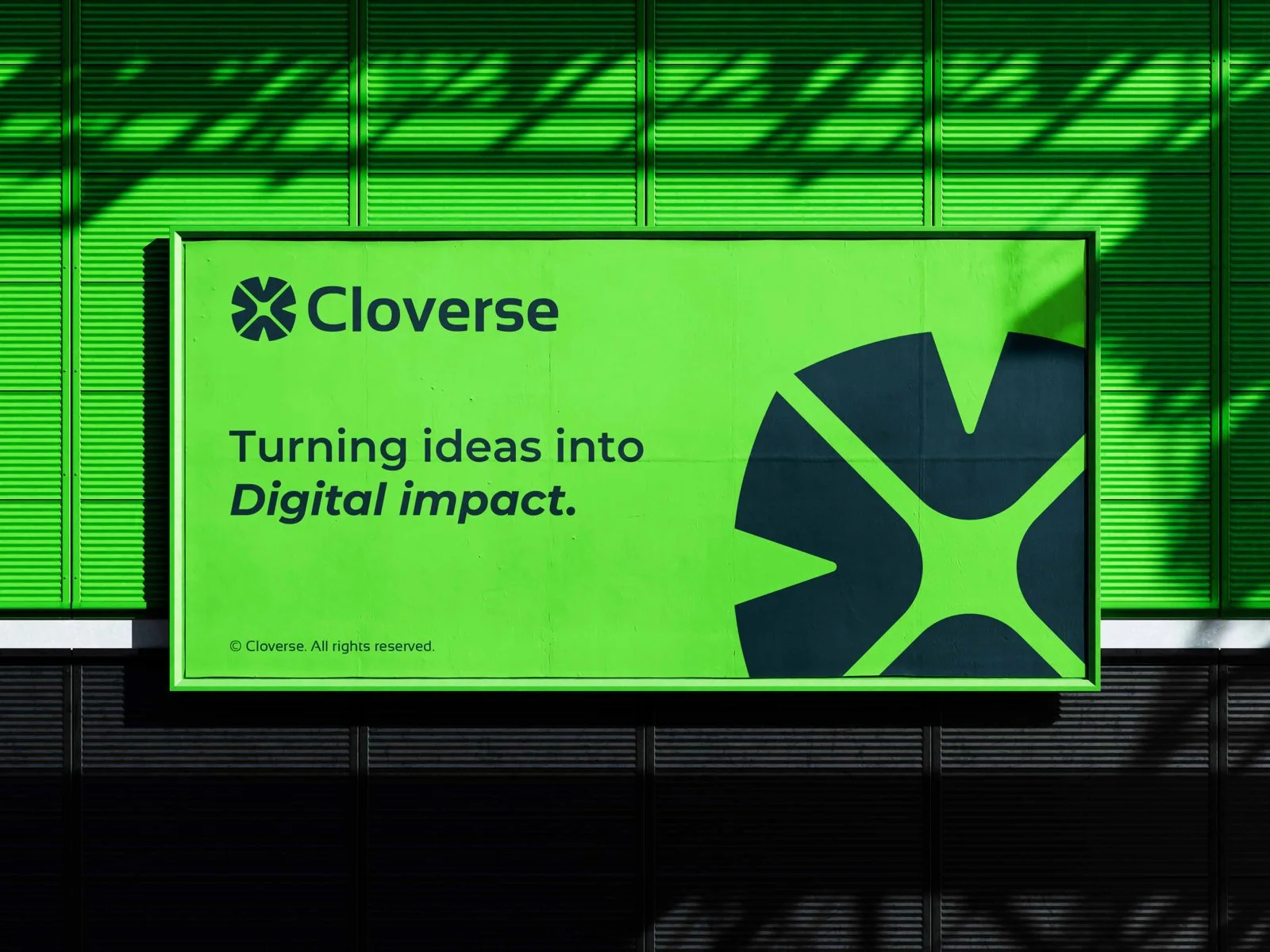
Turning ideas into digital impact, on a bold lime billboard in a metropolitan core.
Strategic Objective
The Challenge & Goal
Prove the optical clarity and memorability of the Cloverse visual identity when scaled to massive 48-sheet outdoor and highway billboard formats.
Creative Direction
Aesthetic Concept & Atmosphere
Uncompromising visual contrast: bold clover lime field with high-impact typography reading clearly from 100 meters away.
Execution
Design & Engineering Approach
We analyzed view distance optics, pedestrian sightlines, and motion blur to ensure the core value proposition registers in under 2 seconds.
Scope & Deliverables
What was crafted
- Large-Format CMYK Vector Production Artwork
- High-Resolution Print Scaling Guides
- Environmental Light & Distance Simulators
Visual Details
Asset Gallery & Application
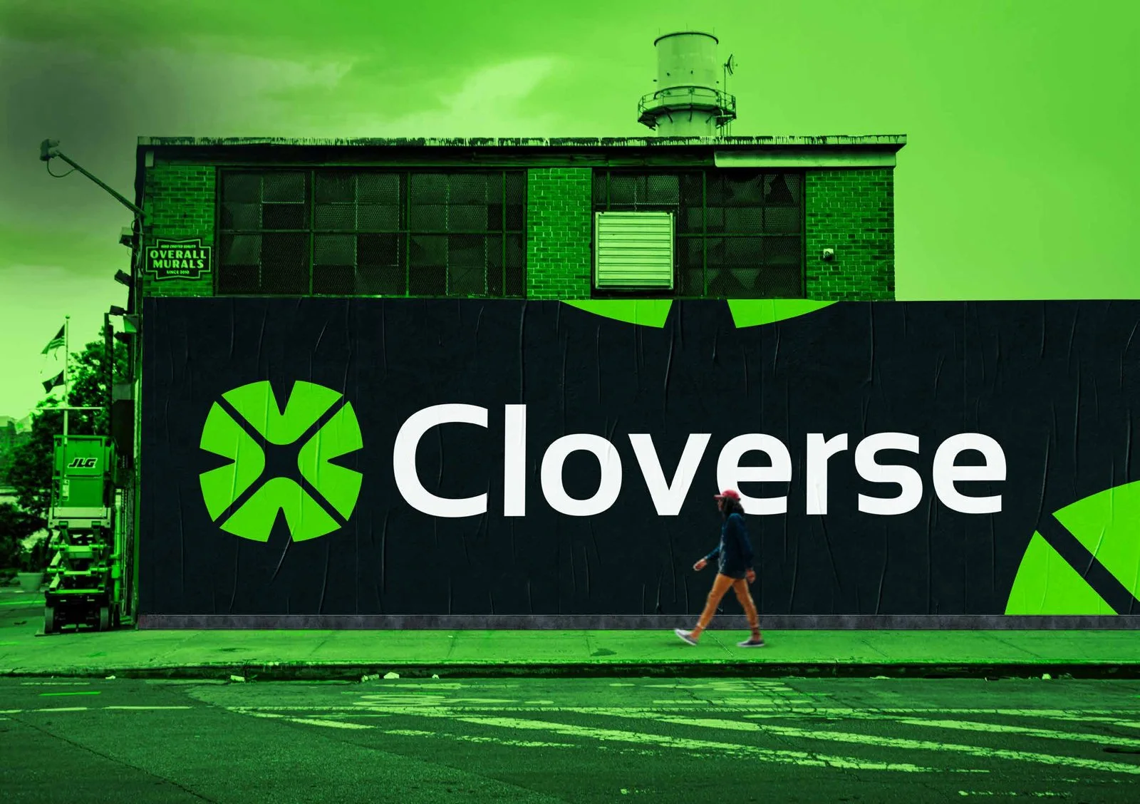
The Cloverse wordmark scaled across an urban architectural wall.
Interested in similar craft?
Let's build your project together.
Every project is custom-designed and engineered to the highest standard. Connect with our team to discuss your goals and receive a clear proposal.